
LOG 1 — 4:: Somewhere in thereNext LOG
They had already been at it for a while, like a month, or a long minute. Everyone on board wore an expression of intense focus, eyes locked on one of the polished surfaces where the text ran, uninterrupted. They somehow knew it all depended on their understanding of what appeared there. It had to be the key — thorough instructions on how to get out of this whole situation, whatever it was — and the slow pace at which the letters faded in and out gave a sense of trust, a quiet assurance that it was all going to be fine.
They were able to follow what they were reading without difficulty. They knew the language. They understood the words. And yet, although they didn’t notice it, they couldn’t seem to hold on to their meaning for very long. As soon as a line disappeared, its content slipped away like thick liquid through open fingers. Sometimes they would repeat a sentence out loud as it appeared, hoping the sound would make it stay. It didn’t. Occasionally, someone would open their mouth and raise their arm, perhaps about to give an order, but nothing ever came.
It had to do with the letters. At first they had seemed familiar, sturdy but kind. Not unlike a countryside house whose door is never locked. Then, without warning, the ship had stopped responding — subtly, almost politely — and the text-based navigation system began to falter, its letterforms misbehaving. Skipping, stuttering, or curling in on themselves like they’d just received bad news.
AB2
CD3
EF4
GHI
JKL
MNO
Analyzing...Ferro...
Analyzing...Ferro...Analyzing...
Analyzing...Analyzing...Analyzing...
Ferro...Analyzing...
PQR4
STU
VWX
YZ5
016
237
LOG 2 — 4:: Somewhere in thereNEXT LOG
They started refreshing too quickly, flickering in and out before they could fully resolve. Lines blurred. The screen, or surface, or however one might describe the visual presence, began to display these partial letters, jagged and incomplete. Almost foreign.
There was something different, raw and fascinating about these new fragmentary contours. Some of the crew, those not engaged in the delicate art of pressing buttons and hoping, found themselves captivated. The shapes felt urgent. Primitive. They had the odd, suggestive weight of debris from a system that once made sense. As if each stroke was on the verge of meaning something. Like something heard in a dream. Or worse: did mean something, and they just couldn’t remember what.
The room itself had changed as well, though no one seemed to notice. The matte metal interior, with its elements of unspeakable complexity, nested compartments and braille-like ridges, so technical they were almost poetic — all of it was morphing, moving through a long sequence of simplifications. A ballet of dissolving surfaces.
These alterations came in pulses. Some were instantaneous. Others stretched out interminably, one surface or corner morphing over what felt like several days, though the whole phenomenon lasted no longer than a blink.
I
II
III
IV
REG.
ITL.
BLK.
I
II
III
IV
MONO.REG.
MONO.ITL.
MONO.BLK.
LOG 3 — 4:: Somewhere in thereNext LOG
Before all this, there had been something else: an orientation protocol, a meal routine, a form to fill out, possibly a birthday. The ship was designed to maintain a structured environment, ensuring both physical and psychological well-being. A voice, disarmingly soft with a slight upward inflection, had once reminded them to return to their various tasks. No one had heard the voice in some time.
Still, none of that mattered now. The only thing that occupied the crew’s attention was the slow emergence of the text, now rendered in vaguely translucent purple-black letters, their memories washing away the direct past like a spring on a treadmill, their eyes watering from staring at the stream of broken curves. It hovered just beneath the surface of vision, like trying to read a reflection on tinted glass. The effect was soothing. That is to say: numbing.
No one had addressed anyone else in a while. Not out of hostility. It simply hadn’t seemed necessary. Each person was stationed somewhere in the room, which might once have been a command deck, or a research bay, or a cafeteria. They stood or sat or leaned, always facing the shifting display, jaws clenched in hopeful concentration.
The letters had become slightly sharper again. They now resembled some formal system, but not one anyone could name. There were loops, hooks, and counters, sometimes perhaps diacritics. But everything was subtly off. Parts were too long or too short. The rhythm was unfamiliar. Still, they read.
LOG 4 — 4:: Somewhere in therePREV LOG
At one point, a low chime sounded. This caused some to flinch, others to smile involuntarily. It had been a while since they had heard anything auditory from the ship. The chime was followed by a short burst of speech, heavily distorted, and whatever meaning it had gotten lost somewhere between ear and brain. The sound did not repeat.
After this, the letters on the surface began to slow again. Each one arrived in a smooth transition, fading in from beneath a layer of interference. Time passed, or didn’t. A smell entered the room, faintly metallic, then vanished. Someone adjusted their posture. Someone else exhaled for the first time in several minutes.
They had nothing else than the letters to worry about. Air was filtered. Fluids were recycled. The equipment aboard would keep them alive and well for a very long time, sailing in a reassuring straight line. Nothing to do but try and swim up a river of immediate obsolescence, sure that salvation lay at its origin.
:⋅:⋅:⋅:⋅:⋅:⋅:⋅:⋅:⋅:⋅:⋅:⋅:⋅:⋅:⋅:⋅
:⋅:⋅:⋅:⋅:⋅:⋅:⋅:⋅:⋅:⋅:⋅:⋅:⋅:⋅:⋅:⋅:⋅:⋅:⋅:⋅:⋅
:⋅:⋅:⋅:⋅:⋅:⋅:⋅:⋅:⋅:⋅:⋅:⋅:⋅:⋅:⋅:⋅:⋅:⋅:⋅:⋅:⋅
:⋅:⋅:⋅:⋅:⋅:⋅:⋅:⋅:⋅:⋅:⋅:⋅:⋅:⋅:⋅:⋅:⋅:⋅:⋅:⋅:⋅
:⋅:⋅:⋅:⋅:⋅:⋅:⋅:⋅:⋅:⋅:⋅:⋅:⋅:⋅:⋅:⋅:⋅:⋅:⋅:⋅:⋅
:⋅:⋅:⋅:⋅:⋅:⋅:⋅:⋅:⋅:⋅:⋅:⋅:⋅:⋅:⋅:⋅
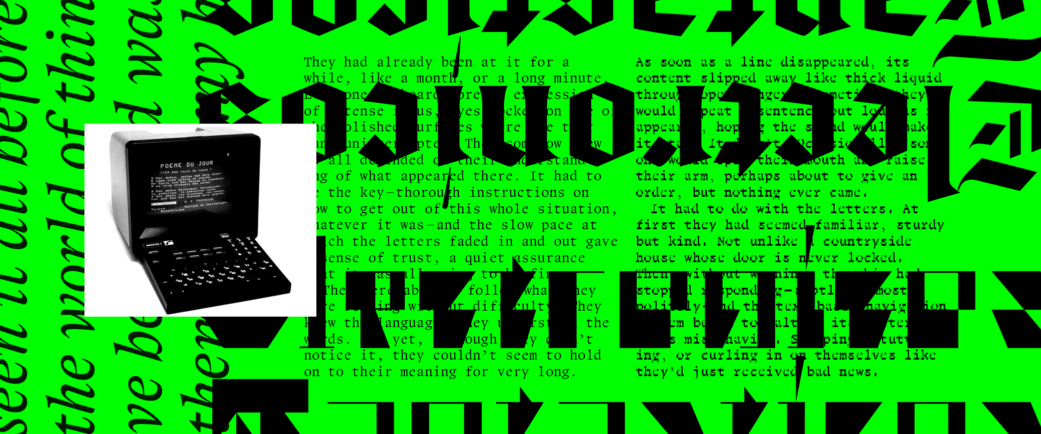
Ferro is a type family exploring ideas of obsolescence and information loss, a conjectural bridge between Renaissance metal type and the early computer age. It was originally developed as a display typeface for CodeX, an editorial project dedicated to digital cultures and alternative production tools. The second issue, designed by the experimental graphic design collective Bonjour Monde (then composed of Raoul Bonnaffé, Lucas Descroix, Benjamin Dumond, and Arman Mohtadji) revolved around “media archaeology” and the work of the PAMAL (Preservation & Art – Media Archaeology Lab), with a particular focus on the Minitel.
Introduced in France in the early 1980s, the Minitel was the most widespread and successful videotex system before the rise of the World Wide Web. Officially discontinued in 2012, it hosted an enormous range of services, from messaging and online dating to games and information directories, and became, for some artists, a medium of creation in its own right. One cited example is the Videotext Poems by Brazilian artist Eduardo Kac, a series of telematic poems in which animated geometric shapes gradually become letters, then words. The work was inseparable from its conditions of display: the interaction with the terminal, the limitations of the network, the particular colour palette of the Brazilian Minitel, and the left-to-right raster scan of CRT screens. Even the video documentation later provided by the artist only partially conveys the experience of the original work.
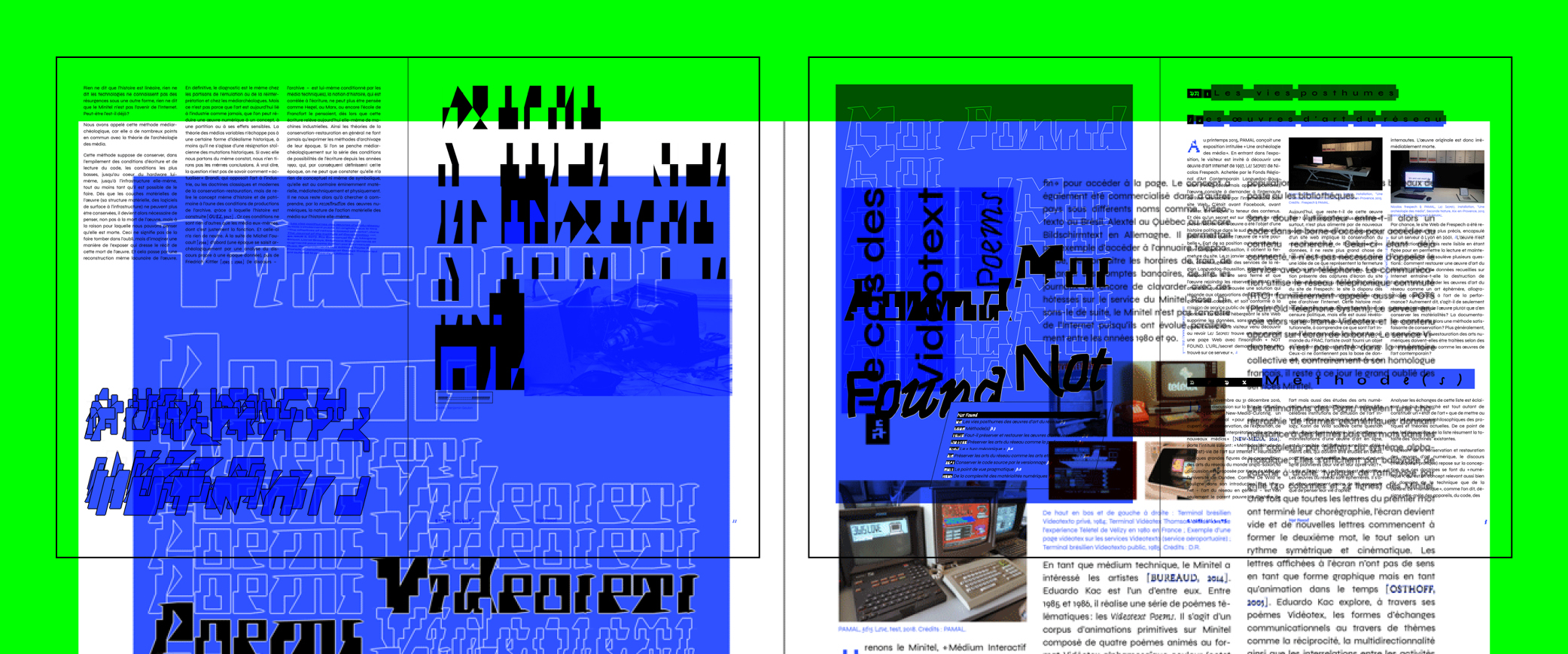
This question ran throughout the entire issue of CodeX: how can medium-specific works survive once the technologies that produced them disappear? Digital art is deeply tied to industrial systems and technological cycles that quickly render hardware and software obsolete. The PAMAL researches works whose original material conditions have vanished, leaving only fragmented traces and incomplete documentation. Through reconstruction and retro-engineering, they attempt to recover these works while confronting the inevitable loss of information that occurs in the process. In the best cases, what remains resembles a form of notation or sheet music, material that still requires interpretation in order for the work to exist again.
As designers, this tension between preservation and transformation felt immediately familiar to us. Typography constantly negotiates between historical forms and contemporary uses, between conservation and reinterpretation. Working from traces, reproductions, or damaged material is often less about faithfully reproducing the past than about rebuilding it from partial information, and Ferro attempts to make this visible. Reviving existing works raises many questions, some of which are addressed in John Downer’s Call it What It Is, originally published in 2003 in the specimen booklet for the typeface Tribute. Seeing a parallel between type revival and the preservation issues surrounding early digital art, we became interested in materialising the idea of information loss through typography itself, not simply as a concept, but as a formal system capable of generating its own visual language.
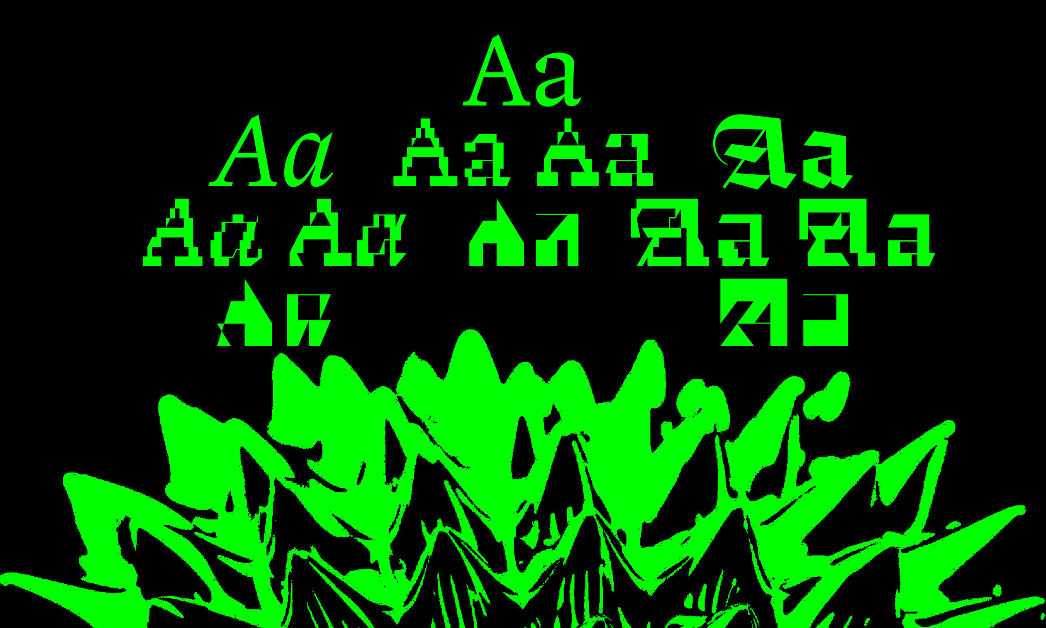
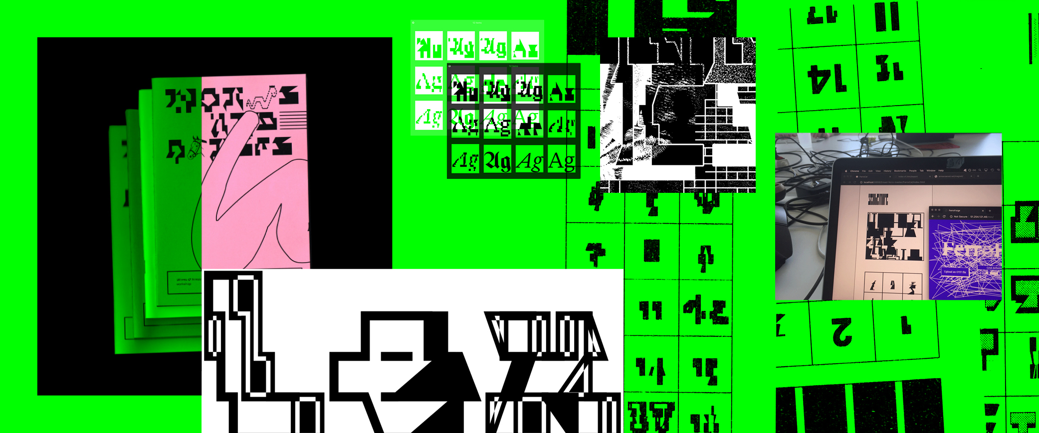
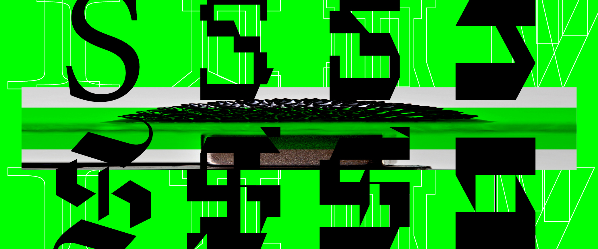
To explore this idea, we began experimenting with Magnet Mike, a vector distortion program imagined and developed by Arman Mohtadji. Its principle is simple: a shape drawn with a mouse or trackpad is snapped onto a grid whose resolution can be adjusted. Depending on the density of the grid, the resulting forms range from slightly degraded to almost completely abstract. Magnet Mike quickly became a recurring tool for Bonjour Monde in workshops and public events. Its immediacy made it accessible to virtually any audience, while its unpredictable results translated particularly well to plotting and physical output.
At some point, it became obvious that the same process could be applied to typography itself: a typeface becoming the source material for successive stages of transformation. This process eventually evolved into a custom set of scripts acting less as drawing tools than as translation machines, repeatedly forcing letterforms through grids of varying resolutions. But unlike a rigid pixel grid, this system does not enforce strict orthogonality or uniform alignment. The grid behaves more like a field of constraints than a fixed structure: oblique tensions, intersecting paths, and local approximations constantly shift the geometry of the letterforms. Rather than generating finished forms, the process produces unstable interpretations, shapes oscillating between preservation and collapse.
Rather than starting from a purely contemporary model, we chose to base Ferro on a historically grounded source. The ideas of translation, reinterpretation, and erosion naturally led us toward Renaissance typography, toward forms that already carried the marks of transmission, printing constraints, and historical distance. Conveniently, we already had the foundations of such a project in our archives: an unfinished type family of mine, gathering digital dust in a forgotten corner of my computer.
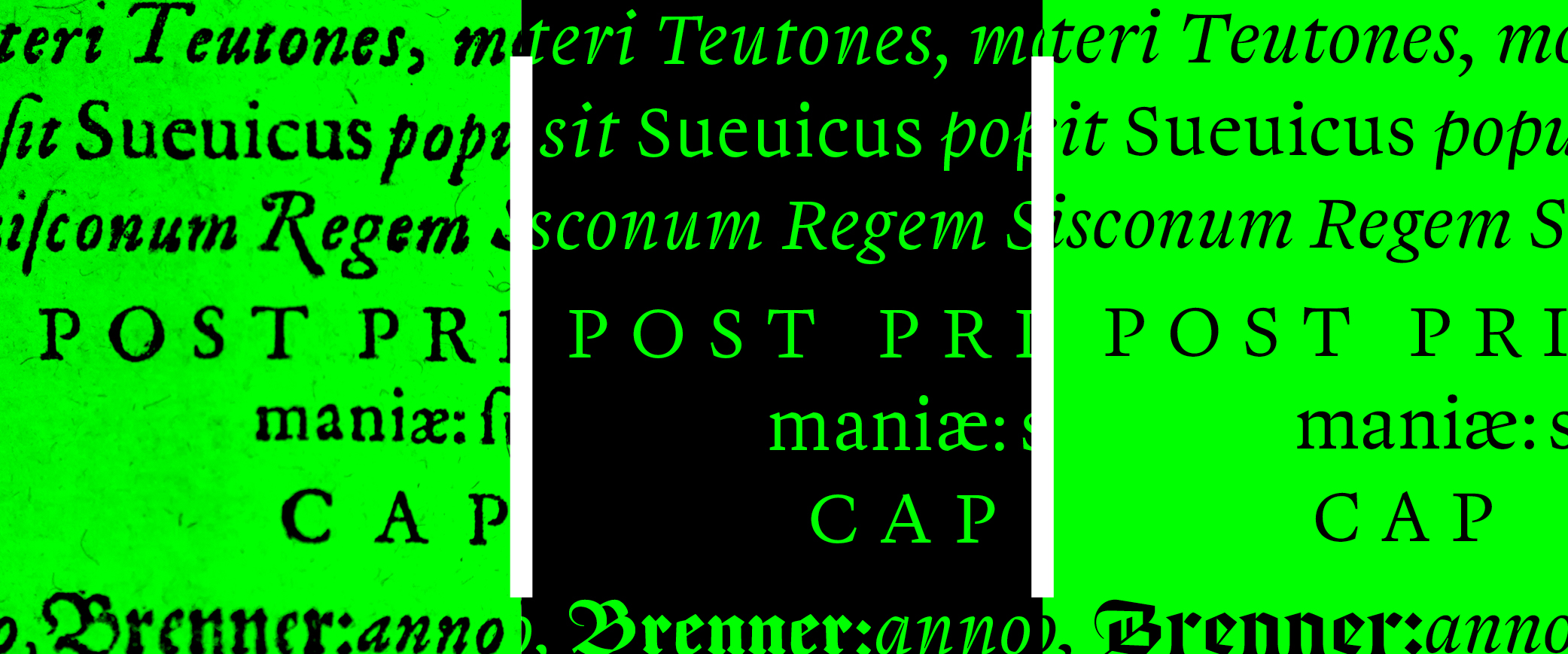
Initially developed in 2015 at the Haute École des Arts du Rhin, this family explored the interpretative dimension of type revival. Its source material was the Annales Suevici, written by Martin Crusius and printed in 1595 by Nicolas Bassaeus, an extensive compilation of historical and geographical events related to the region of Swabia, in present-day southwestern Germany. Beyond its title pages and occasional Greek passages, the volume combines three distinct typographic styles: a Regular and italic in the French fashion of the time, paired with a dense blackletter used for German names and expressions.
“Men don’t remember the past; they always re-build it. They start from the present — and it’s from there that, always, they know and interpret the past.” These words by historian Lucien Febvre, co-founder of the École des Annales, resonated with me. Rather than treating history as a fixed collection of facts, the Annales school understood it as something constantly rewritten through the lens of the present. Ferro’s earliest cuts were designed with a similar perspective: not as faithful reproductions, but as contemporary readings of historical material.
Ferro began as a slightly condensed text face with open apertures, short vertical proportions, and sharp detailing. Early versions retained a number of idiosyncratic details and printing accidents; over time, the design shifted away from this rawness toward a softer, more classical tone. The Italic continues this movement but introduces a different kind of tension, balancing sharpness with fluidity. Details such as the gently bent ‘p’ contribute to a texture that remains readable while introducing moments of visual friction within the text. As Lucien Febvre writes, history is never simply recovered but continually rebuilt from the present. In that sense, Ferro, despite being a revival, has known many forms, each time shaped by contemporary constraints, tools, and subjective interpretation. The version released is only one moment in this process, stabilised at a given point in time, where the work could just as easily have continued to drift for another decade.
Rather than introducing a conventional bold weight, Ferro incorporates a blackletter that occupies a structural role within the family rather than a purely display one. In the Annales Suevici, the original Fraktur already functioned as a secondary text layer despite its inherent complexity; Ferro Black pushes this logic further, shifting it toward a more text-friendly and contemporary reading condition. It repositions blackletter away from historical density and toward Regular-like proportional stability, aligning it with current reading expectations rather than ornamental excess. What remains of its specificity is expressed only through peripheral nodes, thin calligraphic details where the system briefly exposes a different level of tension within an otherwise stabilised geometry. Altogether, Ferro is not a faithful revival; its historical source acted less as a reference than as a point of entry into a system where styles and their successive transformations continuously contaminated and reshaped one another.
Ferro follows an intentionally unusual structure, replacing traditional notions of weight with progressive stages of digital decay. Across Regular, Italic, Black (and the corresponding monospaced styles) the same structure repeats: four stages of transformation, where each step moves the form further away from its source condition. Rather than assigning styles according to conventional typographic functions, the system prioritises shift and perceptual instability. Depending on the context, Ferro can switch between restrained reading texture, rigid computational rhythm, and near-abstract display forms.
The typeface takes its name from ferrofluids, liquids containing magnetic particles that react dramatically when exposed to magnetic fields. Smooth surfaces suddenly erupt into unstable spikes and granular formations. The family structure operates through a similar dynamic: moving from relatively calm and historically grounded structures toward rough, fractured, and increasingly ambiguous forms. While Ferro originated as a display experiment, the project progressively expanded into a broader typographic ecosystem. Its calmer styles can function as sharp and textured reading faces, while the more degraded cuts move toward expressive display territory.
The introduction of monospaced companions further extended the family into editorial systems, interfaces, and computational environments, reinforcing the dialogue between historical structures and digital constraints. Ferro does not attempt to restore historical forms to an imaginary original state. Instead, it treats history as unstable material: something continuously rewritten through transmission, reproduction, interpretation, and technical constraint. Between Renaissance printing and early networked media, the family inhabits the space where preservation becomes indistinguishable from mutation. The typeface is an extrapolated stone fragment, a piece of fossilized wood, a layered rumor; it speaks of the difficulty to fully comprehend past artefacts and even more so the fragility of our contemporary digital files.
In emulating obsolescence, Ferro oscillates between two seemingly opposite conditions. On one side lies the coldness of systems: grids, algorithms, low-resolution displays, and mechanical repetition. On the other lies a more poetic and anti-utilitarian dimension, where distortion becomes structure for both individual letters and the typeface as a whole. Erosion is not treated as damage, but as a productive force capable of generating unfamiliar textures, rhythms, and reading experiences.
:⋅:⋅:⋅:⋅:⋅:⋅:⋅:⋅:⋅:⋅:⋅:⋅:⋅:⋅:⋅:⋅:⋅:⋅:⋅:⋅:⋅:⋅:⋅:⋅:⋅:⋅:⋅:⋅:⋅:⋅:⋅:⋅:⋅:⋅:⋅:⋅:⋅:⋅:⋅:⋅:⋅:⋅:⋅:⋅:⋅:⋅:⋅:⋅:⋅:⋅:⋅:⋅:⋅:⋅:⋅:⋅:⋅:⋅:⋅:⋅:⋅:⋅:⋅
:⋅:⋅:⋅:⋅:⋅:⋅:⋅:⋅:⋅:⋅:⋅:⋅:⋅:⋅:⋅:⋅:⋅:⋅:⋅:⋅:⋅
:⋅:⋅:⋅:⋅:⋅:⋅:⋅:⋅:⋅:⋅:⋅:⋅:⋅:⋅:⋅:⋅:⋅:⋅:⋅:⋅:⋅
:⋅:⋅:⋅:⋅:⋅:⋅:⋅:⋅:⋅:⋅:⋅:⋅:⋅:⋅:⋅:⋅:⋅:⋅:⋅:⋅:⋅:⋅:⋅:⋅:⋅:⋅:⋅:⋅:⋅:⋅:⋅:⋅:⋅:⋅:⋅:⋅:⋅:⋅:⋅:⋅:⋅:⋅:⋅:⋅:⋅:⋅:⋅:⋅:⋅:⋅:⋅:⋅:⋅:⋅:⋅:⋅:⋅:⋅:⋅:⋅:⋅:⋅:⋅